Landing a dream job often requires more than just the right skills and experience — you also need a resume that stands out. But what makes a resume successful?
To bring some clarity to this, Kickresume has analyzed 394 resumes that succeeded in securing roles, even at world-renowned companies like Apple, Google, Amazon, and government institutions like the Ministry of Finance.
We've examined every bit of these resumes — standard resume sections, word choice, length, design, even the font usage and more.
And we've got some pretty great insights into what makes a good resume really good. Read more for our top findings of the analysis, what actually works, and how you can use it to your advantage as you craft your own resume.
Note: The data was collected and analyzed by our internal data science team, allowing us to provide an in-depth look into the resume-writing process. All resumes were shared with the consent of our users, and the data were collected anonymously, excluding users' personal information.
All successful resumes put into one ideal CV
There's no one-size-fits-all resume. However, there are common characteristics that successful resumes share.
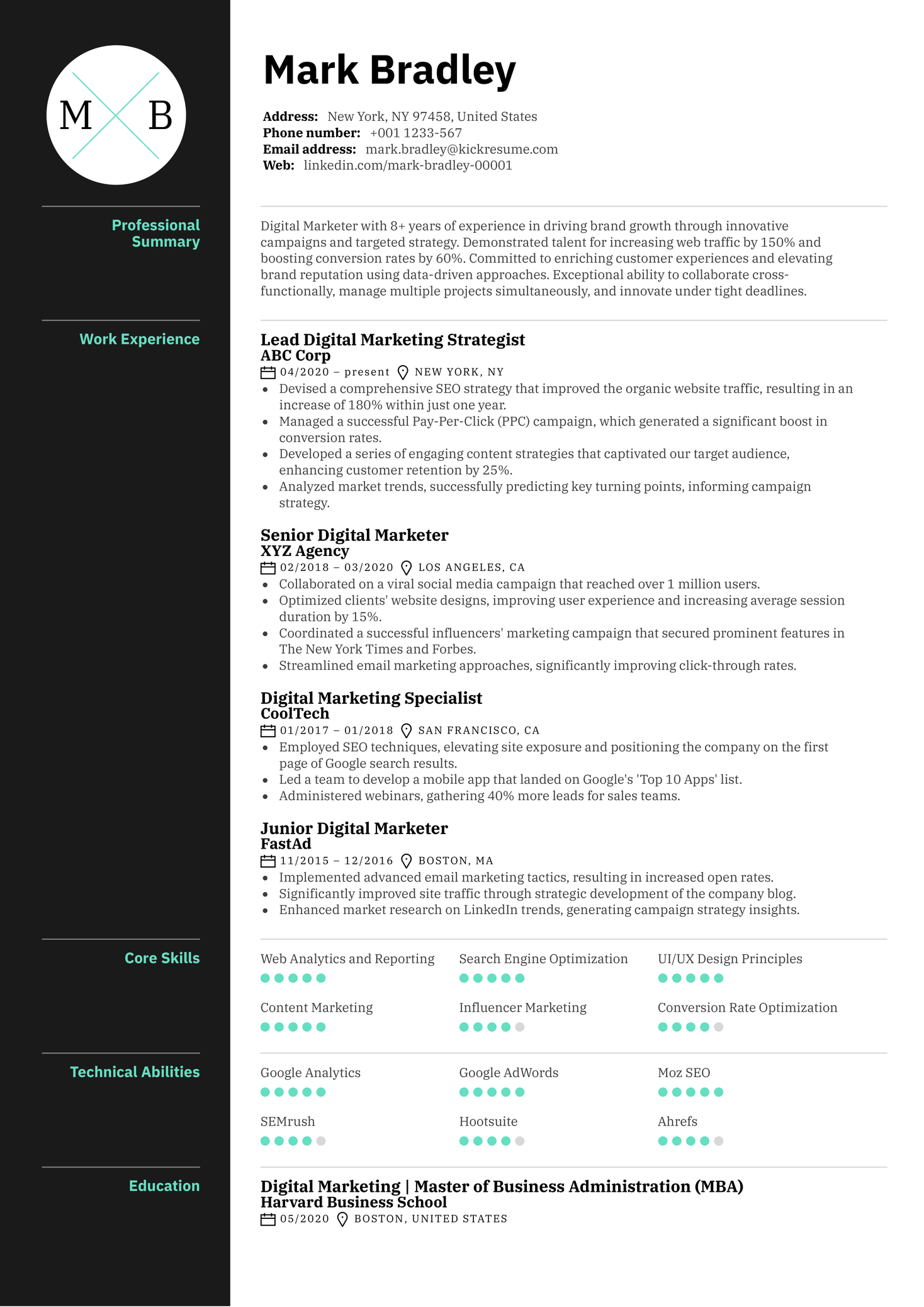
According to our analysis and findings, this is what an ideal resume that gets jobs at top companies looks like:
Did you notice anything about that resume?
Based on our key findings, the standout features are:
- Contact details: Resumes included crucial contact details like email (96%) and phone (95%).
- Resume summary: 70% of successful resumes included a resume summary, with the average length of 57 words.
- Work experience: Almost all (99.8%) resumes had a work experience section. The biggest group of applicants (30%) chose to detail 4-7 positions in their work experience section, described with an average of 56 words each, painting a picture of roughly 8 years of industry experience.
- Education: 98% of resumes included an education section.
- Word choice: Successful resumes exhibit a keen use of action-oriented and result-driven words. For example, "implemented," "developed," and "managed" were popular choices. On the other hand, they also included some cliché phrases and filler words such as “responsible for”, “and”, “in”, which should be avoided.
- Quantifiable achievements: On average, successful resumes included 5 quantifiable achievements.
- Resume length: The median resume length was 443 words, or slightly over one page on the Kickresume template.
- Resume design: The biggest group of applicants, 40 out of 394, used a classic one-column Ladder resume template. Also, the top 7 templates in the top 10 list favor a more minimalist design.
- Visual elements: 76% of resumes incorporated at least some sort of visual element (be it icons, bars, graphs), with skills bars being most popular (present in 63% of resumes).
- Bullet points: Successful resumes typically used an average of 28 bullet points. The ideal number of bullets per individual section resulted in 4. When it comes to length, each bullet point in successful resumes had an average of around 19 words.
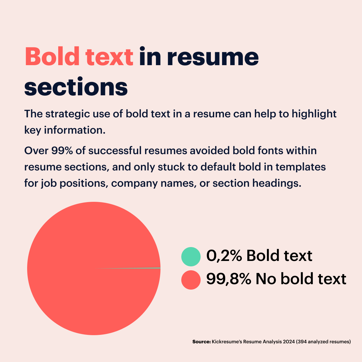
- Bold font: Over 99% of successful resumes largely avoided using bold fonts within their resume sections, and only stuck to default bold fonts in resume templates for job positions, company names, or section headings.
1. Contact details
According to our findings, all successful resumes included at least one form of contact. Here's the breakdown:
- Email: A glowing 96% of successful resumes included an email address. But that means, a surprising 4% didn't.
- Phone: Not far behind, 95% of the resumes included a phone number. Still, it means there were 5% of job seekers who missed this key detail.
- Web/ Online Profile: This category was more flexible, with 44% choosing to include a website link or online profile like LinkedIn, and 56% leaving this detail out.
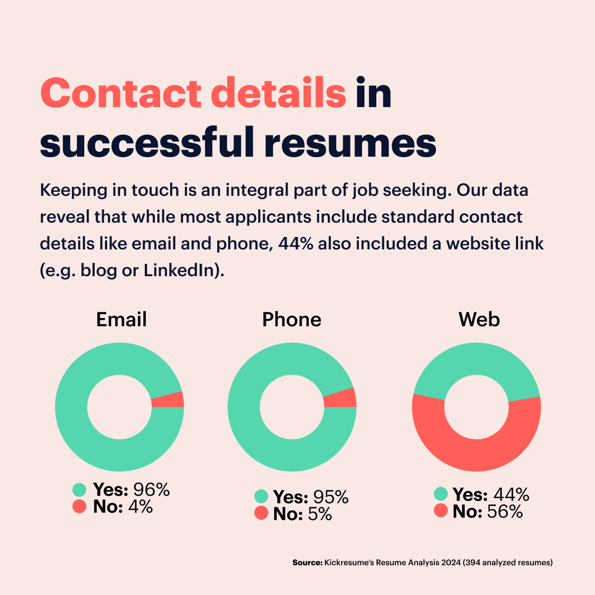
This data tells us that the majority of job seekers include phone and email on their resume, but there was also a small number of people who missed these crucial details.
What does this mean for you? A few very important things:
Absolutely don't forget to include your email and phone number. It may seem obvious, but considering around 4-5% people missed one of these crucial details, it's worth emphasizing. Potential employers need a quick and straightforward way to get in touch with you, plain and simple.
Consider including a clickable link. This can be a link to your LinkedIn profile, blog, personal website, or other online portfolio. As you can see from our findings, this isn't a necessity, but on the other hand, it's becoming more common and can boost your chances. This is especially true if you work in a creative field.
2. Resume summary
Resume summary is a little paragraph that sits at the top of your resume and gives a little snapshot of you as a candidate. Think of it as your elevator pitch.
Our statistics show that 7 out of 10 successful resumes included a resume summary.
When it comes to the length of the summary, things vary:
- The shortest we saw was a mere 7 words, while someone else just couldn't hold back, cramming in a whopping 289 words.
- On average, though, most people kept their summary around the 57-word mark.
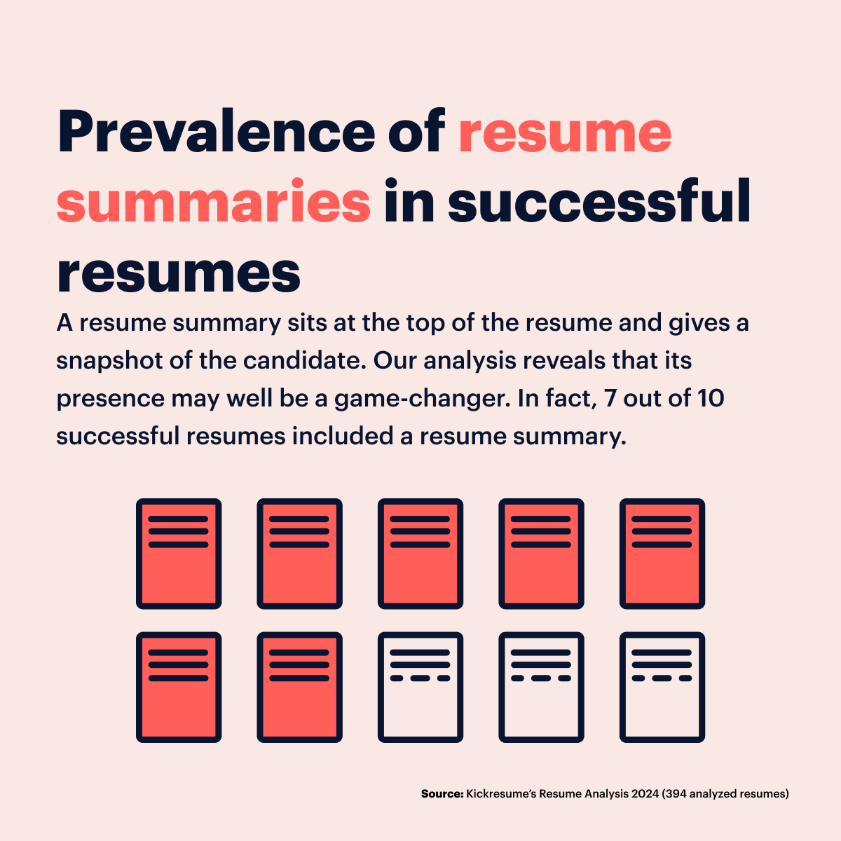
A well-crafted resume summary can make a big difference. The fact that around 70% of successful job-seekers included one is a clear signal of their potential worth. It offers a quick snapshot of who you are professionally and what you bring to the table.
3. Work experience
Turning our focus to the work experience section data collected from successful resumes, the following trends stand out:
- Almost all (99.8%) of the successful resumes we analyzed had a work experience section. So it's clear that most hired candidates aren't skimping on this part.
- The biggest group of applicants (30%) chose to detail 4-7 positions in their work experience section. This likely strikes the perfect balance as it allows candidates to showcase a variety of skills and experience, while keeping the description concise and easy for hiring managers to scan.
- The average text length per position was 56 words, yet our analysis uncovered a resume that extended this notion to 339 words. It’s important to note that conciseness can be beneficial given the limited time of an ever-busy hiring manager.
- Though the average length of experience per resume stood at 8 years, some were outliers showcasing a massive 36-38 years of experience. The key strategy, however, lies in selecting and highlighting only the roles that matter most.
And so, it’s safe to say that our resume analysis revealed the blueprint for an ideal work experience section. It typically houses 4-7 significant positions, described with an average of 56 words each, altogether painting a picture of roughly 8 years of industry experience. At least that’s the average per a successful resume.
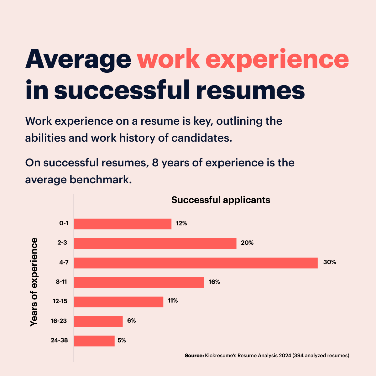
The work experience section is clearly a vital component in the majority of resumes. But we need to realize that its portrayal may differ between seasoned professionals and fresh graduates.
Entry-level candidates may not have extensive industry experience to cover 4 positions, but they can still add value by highlighting internships, volunteer work, part-time jobs, and relevant class projects in their work experience section.
By describing these involvements with clear, concise language, they can showcase their skills, work ethic, and commitment to their chosen field. Additionally, fresh graduates can focus on the transferable skills they've gained through their educational background and extracurricular activities.
All in all, succinct, relevant descriptions and a clear depiction of one's professional timeline remain key to creating winning resumes that catch a hiring manager's eye.
4. Education
While a seasoned professional may find their work experience taking the spotlight, the education section of a resume should never be underestimated. And a close look at successful resumes underscores this idea:
- Of the 394 resumes analyzed, a whopping 98% included an education section, perhaps adding significantly to their success in securing a job.
- Yet, there were a handful of 7 candidates who deemed this section redundant, most likely due to their education not aligning with the targeted field.
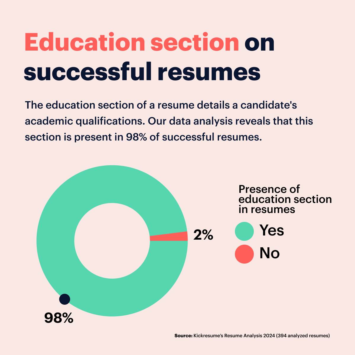
Why are these findings important? Among candidates possessing a similar depth of experience, a well-crafted education section complete with relevant coursework, activities, or certifications might provide the edge needed to stand out.
Even if there’s no clear link between a candidate’s educational background and the job of interest, there's a way to bridge the gap. This can be done by highlighting related school projects, relevant extracurricular activities, or academic achievements.
All in all, the presence of the education section in nearly every successful resume analyzed sends a clear message about its crucial role in the hiring process.
5. Word choice
The choice of words in your resume can significantly impact its effectiveness. Carefully selecting your words can demonstrate your accomplishments, abilities, and fit for the position.
On the other hand, using cliché or filler phrases can appear as unnecessary fluff.
We had a look at the most frequently used words and phrases across three main categories in successful resumes:
- Powerful action-oriented words: These words indicate productive actions, express candidates' skills and achievements, resulting in tangible results. They're considered a must in today's resumes. We had a look at the most used action words in various categories like strong accomplishments, tech, management, creativity, and communication — all useful in various industries.
- Cliché phrases: Cliché phrases are broad, vague phrases that don’t add much specific value or meaning to a resume. While they're not necessarily bad, they tend to be too generic, overused in resumes, and don't provide enough detail about unique skills.
- Filler words: Filler words are commonly used in resumes but add little to no value. In the context of resumes, filler words are pronouns like I, we, their, my, that, which, etc. Moreover, certain adverbs can also be considered filler words. It's often better to replace them with impactful words or phrases.
Here are the top 10 powerful action words used in successful resumes in various categories:
| Top powerful action-oriented words in successful resumes | ||||
| Accomplishments | Tech | Management | Creativity | Communication |
| 1. created | 1. implemented | 1. worked | 1. provide | 1. work |
| 2. implemented | 2. maintained | 2. managed | 2. develop | 2. develop |
| 3. developed | 3. advanced | 3. developed | 3. use | 3. project |
| 4. completed | 4. automated | 4. implemented | 4. project | 4. manage |
| 5. increased | 5. executed | 5. maintained | 5. create | 5. maintain |
| 6. executed | 6. designed | 6. motivated | 6. process | 6. report |
| 7. delivered | 7. analyzed | 7. established | 7. maintain | 7. design |
| 8. analyzed | 8. built | 8. increased | 8. report | 8. lead |
| 9. built | 9. installed | 9. trained | 9. design | 9. plan |
| 10. founded | 10. launched | 10. designed | 10. ensure | 10. perform |
| Source: Kickresume’s Resume Analysis 2024 (394 analyzed resumes) | ||||
To sum up, leveraging these action-oriented words and showcasing your unique abilities effectively can significantly improve the quality of your resume. Aim to strike a balance between popular phrases and unique descriptions of your experiences.
On the other hand, try to avoid using cliché phrases and filler words, even though these were used even in successful resumes.
These were the top 10 used cliché phrases and filler words:
| Most used cliché phrases and filler words in successful resumes | |
| Cliché phrases | Filler words |
| 1. responsible for | 1. and |
| 2. communication skill | 2. in |
| 3. year of experience | 3. the |
| 4. dynamic | 4. on |
| 5. passionate | 5. new |
| 6. innovative | 6. an |
| 7. process improvement | 7. that |
| 8. proactive | 8. their |
| 9. interpersonal skill | 9. my |
| 10. flexible | 10. up |
| Source: Kickresume’s Resume Analysis 2024 (394 analyzed resumes) | |
Use these words sparingly or avoid them entirely, as terms like "flexible" or "communication skills" won’t stand out unless you couple them with concrete impactful examples.
6. Quantifiable achievements
Let's talk numbers — quite literally. Quantifiable achievements are those success stories, accomplishments and milestones in one's career that can be expressed in concrete numerical terms. Hiring managers love them — how about job seekers?
Here's what we found:
- Range of achievements: The number of quantifiable accomplishments individuals pointed out varied widely. Some mentioned none, while a real go-getter listed out 58.
- The middle ground: On average, successful resumes included around 5 achievements.
- Popular choices: The most common number of achievements stated fell within the 0-10 range. Interestingly, around 23% of job-seekers (92 individuals) listed zero, which is quite a large number, while a small 2% (9 people) listed 10 achievements.
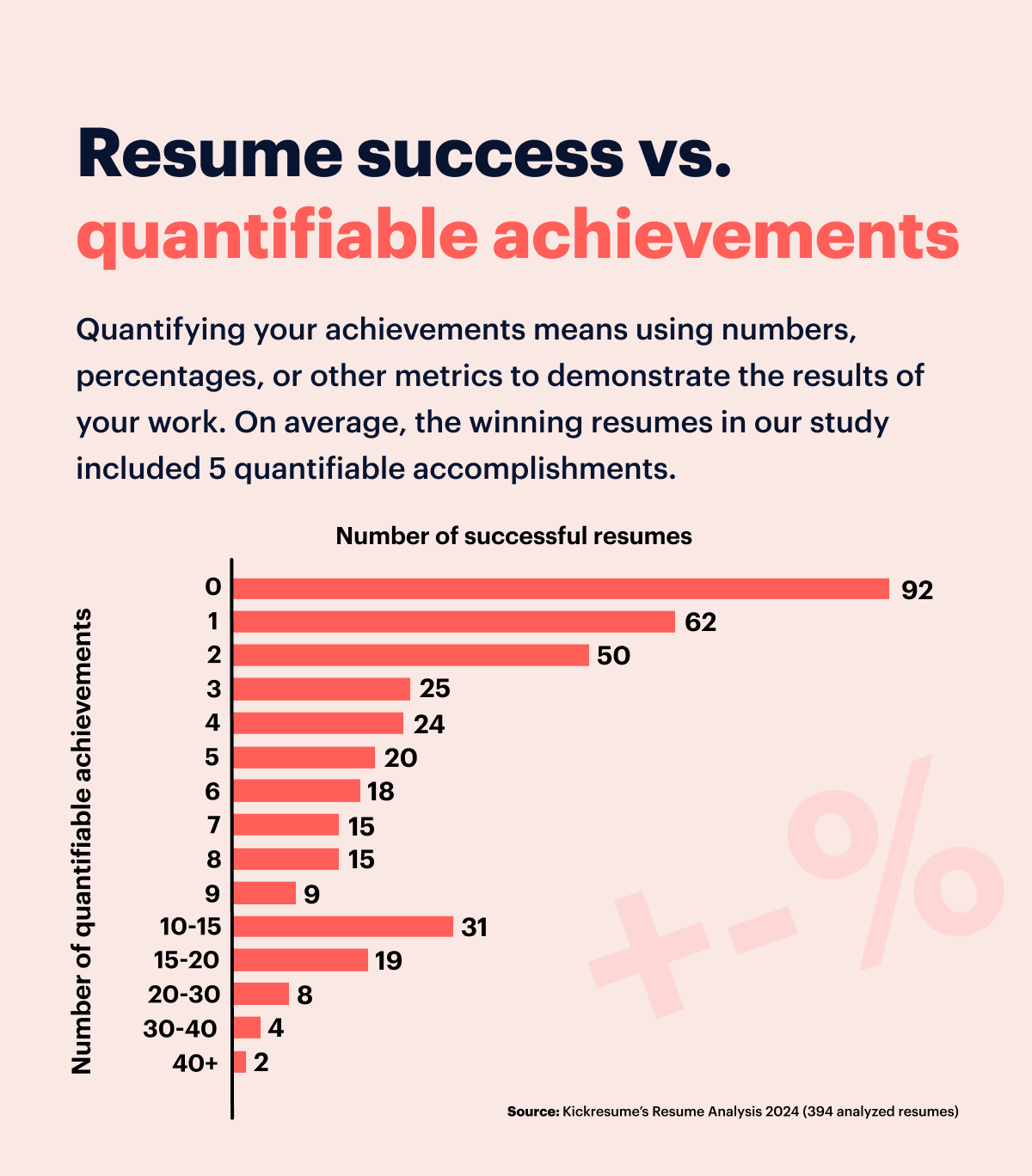
This could seem confusing — why such a wide discrepancy? But here's what you can take from it:
Mentioning quantifiable achievements is generally a winning strategy. They provide solid proof of your capabilities and results. But remember, they need to be relevant for your role.
Also, it's about quality, not quantity. There's no magic number. The average may be 5, but even one solid, relevant achievement can impress more than a long list of irrelevant ones.
Finally, some roles may not lend themselves to quantifiable achievements, which could explain our 23% of 'zeros'. In such cases, focus on your capabilities and how you contributed to your past roles.
7. Resume design
We've also looked into an aspect of the resume that often gets overshadowed by its content — its design. The aesthetics of your resume, believe it or not, can make a significant impression on a hiring manager even before they read a single word.
So, we had a closer look at resume length, resume templates that were used, visuals elements, or the use of bold font and bullet points.
Length
Resume length is one of the most unending debates among job-seekers and experts. So, should it be one-page, two-pages, or...?
We saw all sorts of lengths, from an uber-crisp 103 words to a lengthy 2511 words.
However, our analysis shows that 41% of successful resumes fit within the 400-word limit, which roughly translates to around a single page on Kickresume.
While this isn't the majority, it does form the largest group within our dataset, indicating a strong preference for conciseness among successful job applicants.
Also, the median came in at a comfortable 443 words, which is still slightly over one page.
- Around 30% (117 resumes) expanded to fill 400-600 words, around 1.5 pages long.
- About the 15% (60 resumes) ranged between 600-800 words, which is 1.5-2 pages.
- Just under 8% (30 resumes) opted for a longer approach, with 800-1000 words, which is 2-2.5 pages format.
- The final 10% pushed the boundaries, going beyond 1000 words (2.5 pages and beyond), with one resume even reaching 2511 words (which is over 6 pages).
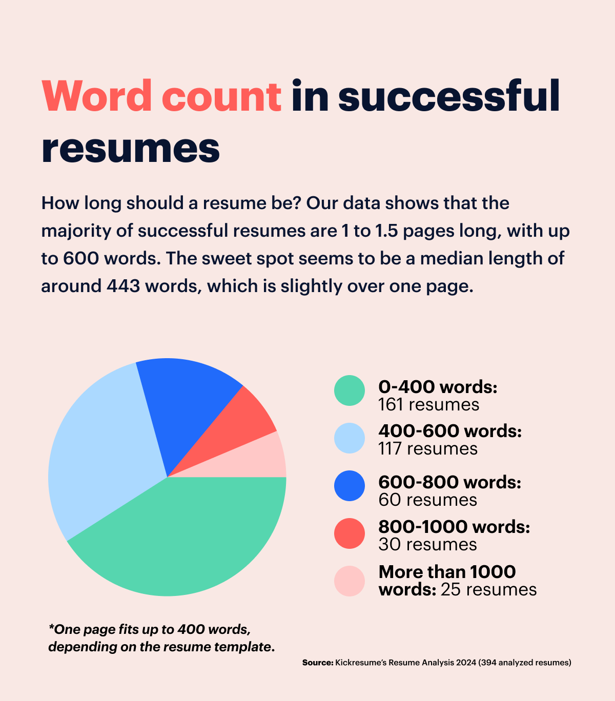
These findings suggest that while successful applicants tend toward brevity, plenty see the need for a bit more space to fully articulate their experiences.
That's why, if your career story calls for it, don't be afraid to deviate from the norm and venture beyond the one-page resume. Our data indicates that the "ideal" length tends to be largely dependent on the individual's unique career narrative and the specific requirements of the job they're applying for.
Resume template
Creating a compelling resume involves more than merely picking a visually appealing template. It should also guarantee a clear and logical presentation of information, making it easy for hiring managers to follow.
Kickresume offers numerous templates, but one that has proven particularly appealing to applicants is the Ladder template. Impressively, 40 out of 394 successful resumes used this design. Additionally, it has been chosen by a staggering total of 379,433 job seekers.
So what kind of templates do successful applicants prefer, according to our analysis?
- Simple and subtle: 7 templates in the top 10 list lean towards more minimalist design.
- Creative but not overbearing: The remaining half of our top 10 indulges in slightly bolder designs, opting for more striking color combinations (such as black and yellow) or introducing unique graphic features like bubbles or ribbons. However, they still don’t detract from the essential content.
- Effective use of negative space: Candidates favored templates that used negative space wisely, creating logical divisions between sections that were easy on the eye.
- Featuring subtle graphic elements: All top 10 templates employed by successful candidates offer simple graphics — from proficiency scales to skills graphics — adding a touch of personality that doesn't overshadow key information.
- One-column dominance: While many successful applicants used two-column layouts, the majority (54% of candidates) opted for single-column templates. These provide ample room to detail skills and experiences and facilitate ATS readability.
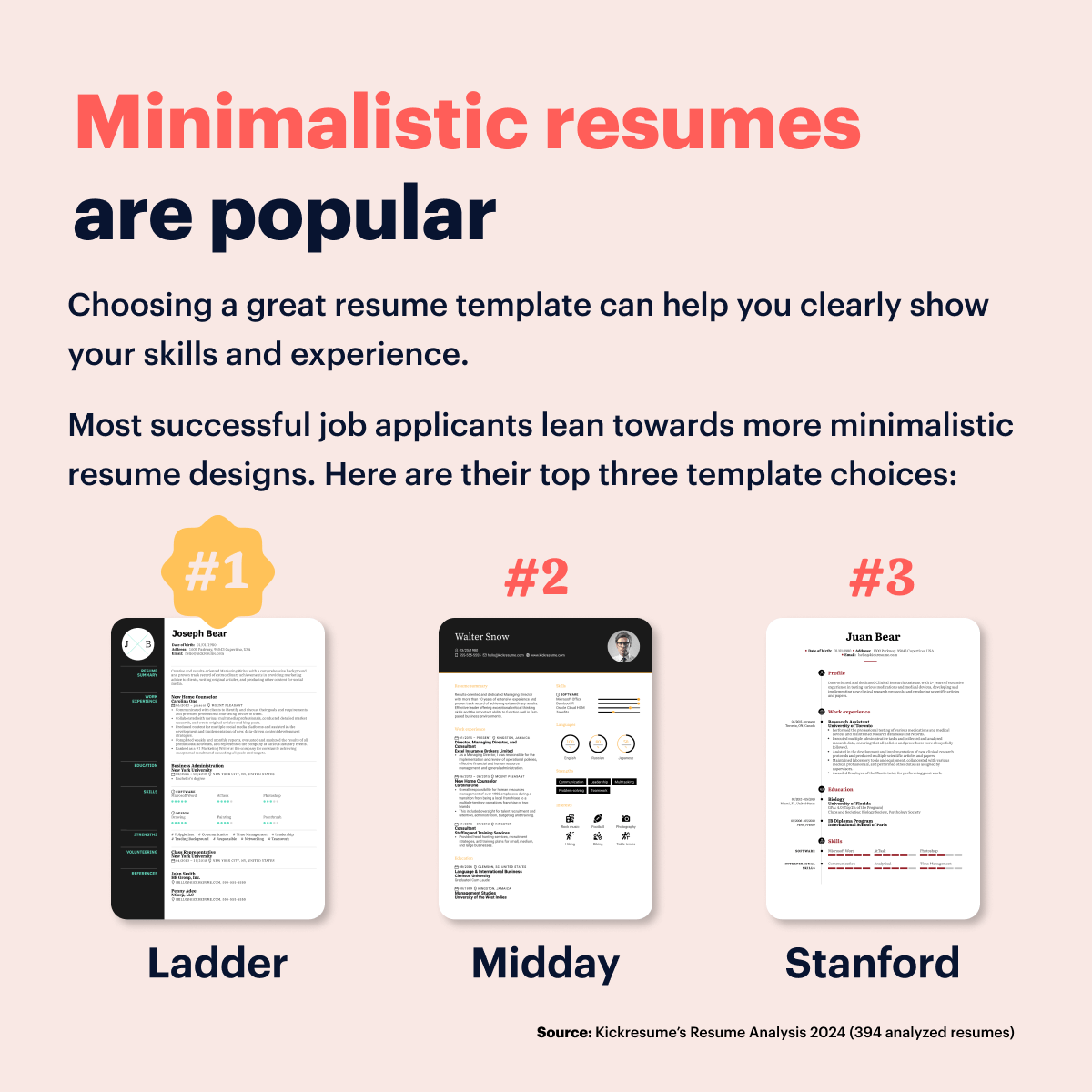
Given all this information, choosing the right resume template involves several considerations. Start with a design that's visually appealing and easy on the eyes. Next, focus on a layout that's easy to understand, effectively showcases your information, and is compatible with ATS systems.
For some inspiration, here are the top 10 Kickresume resume templates favored by successful job seekers:
- Ladder — A classic one-column template
- Midday — A minimalist two-column template
- Stanford — A minimalist one-column template with colorful section headers
- Vegan — A classy one-column template with core strengths highlighted against a subtle color backdrop
- White — A minimalist two-column template with subtle graphs for easy navigation
- Puddle — A creative two-column template featuring a bold color palette
- Bubbles — A creative two-column design featuring colorful and playful graphics
- Sunny — A creative two-column template featuring subtle graphs and icons
- Hoth — A neatly-organized one-column template featuring subtle graphic elements
- Ribbon — An elegant one-column template with a distinctive ribbon element in the headline
Visual elements
Visual elements are increasingly transforming traditional resumes, making them more engaging, memorable, and easy to skim.
Even though the majority of job seekers leaned towards a more minimalistic resume template, a whopping 76% of resumes incorporated at least some sort of visual element, be it icons, graphs, or skills bars.
Job seekers mainly chose to incorporate:
- Visualized skills: In assessing how candidates presented their abilities, we found that about 63% of resumes had a visual representation of skill levels or proficiency. This usually took the form of skill bars.
- Visualized hobbies: About 45% of candidates took advantage of icons to showcase their hobbies. This not only adds visual intrigue but makes the document look less dry and more lively
- Visual graphs: Pie charts were used by a small 15% portion of candidates. These graphs serve to distill diverse data (ranging from how they spend their time to a breakdown of their skills) into a quickly digestible form.
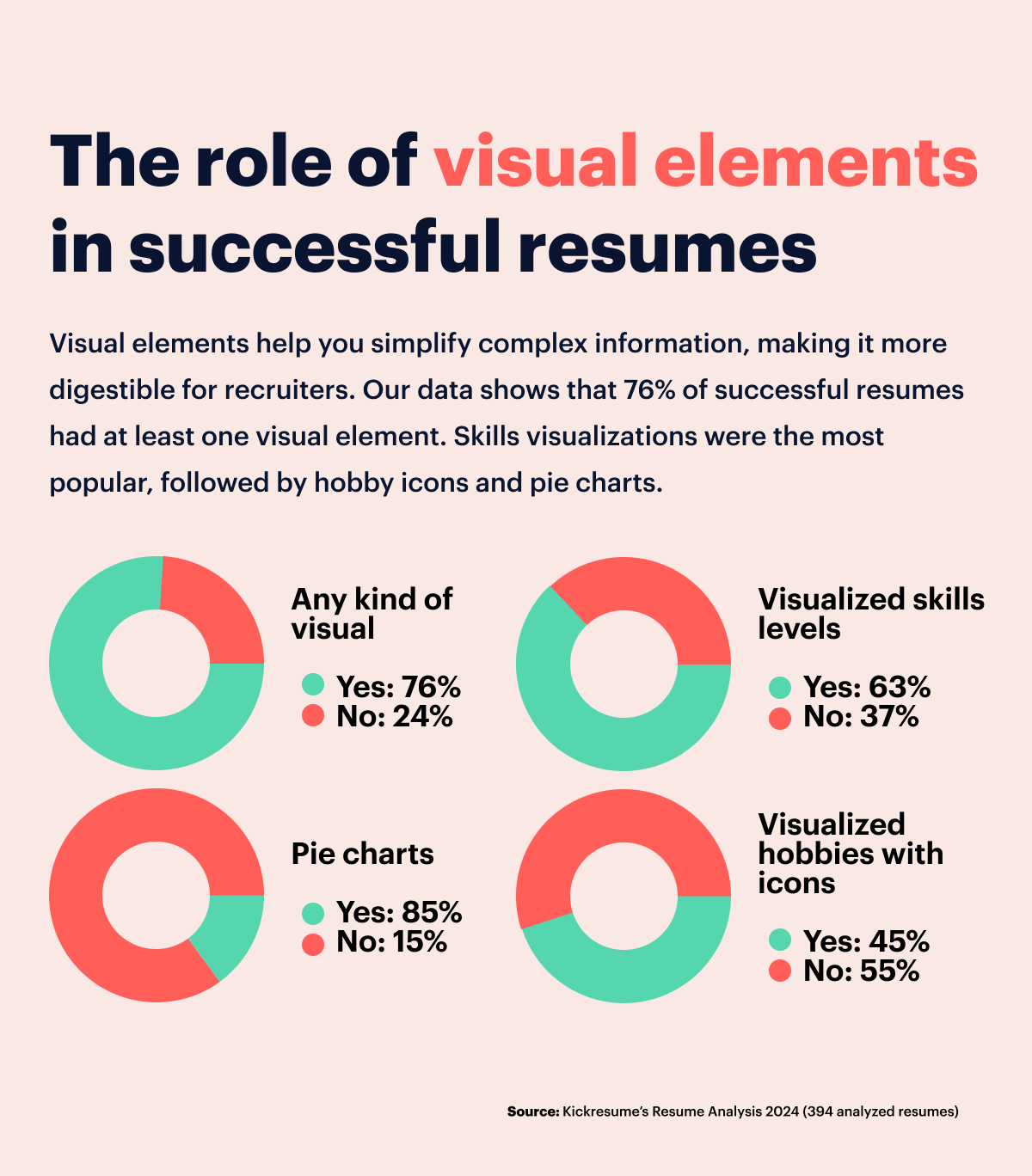
With three-quarters of successful resumes containing some sort of visual, it's clear that well-planned visuals are quickly becoming a must-have rather than a nice-to-have.
Also, graphical skill representations seem to be popular. Beyond mere mentions, ranking your skills or proficiency levels using bars or similar visuals is a great way to convey your abilities quickly.
Bullet points
Bullet points are an indispensable part of a resume. They contribute to better readability, especially in the work experience section, making candidates’ achievements pop. To avoid the dreaded 'no pile', savvy applicants simply use bullet points. No hiring manager wants to read through a dense block of text.
Here’s what our resume analysis revealed about the use of bullet points in successful resumes:
- Successful resumes typically used an average of 28 bullet points. But one particular resume took it as far as using over 95 bullet points throughout, which just seems overwhelming.
- The ideal number of bullets per individual section resulted in 4, a reasonable and uncomplicated number. It's advised to restrict bullet points to a maximum of 6 per position, carefully choosing the most significant, quantifiable accomplishments to highlight.
- When it comes to length, each bullet point in successful resumes had an average of around 19 words. This translates to about 1.5 lines of text in a single-column format. Given that hiring managers often consider anything above three lines to be more of a paragraph, it's generally safer to limit each bullet point to a maximum of 2 lines.
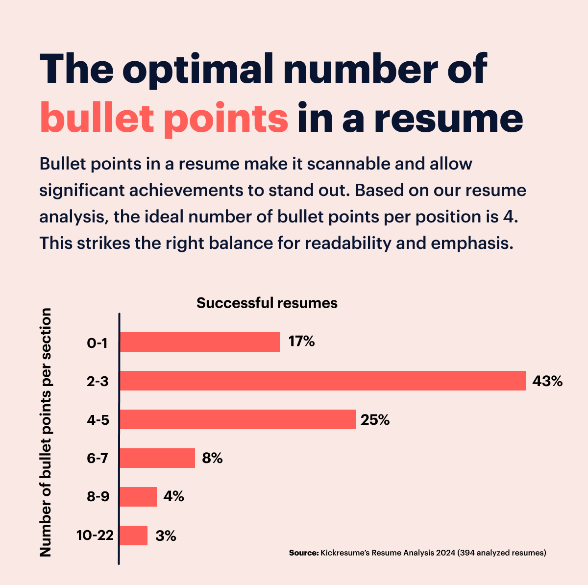
The ideal resume bullet plays a significant role in capturing a hiring manager's attention. The key is in their strategic use — concise, relevant, and not overly crowded — aiming to pack maximum impact into a digestible, easy-to-read format.
Bold font
Employing bold text in your resume can significantly improve its appearance and readability. Typically, it's wise to use it for emphasizing job titles, company names, and section headings. This helps draw attention to the essential parts of your resume.
That said, a word of caution is necessary. Going overboard with bold text can lead to a resume that looks disorderly and confusing. The key is to strike the right balance.
In fact, our analysis shows that over 99% of successful resumes largely avoided using bold fonts within their resume sections. This trend strongly suggests that recruiters lean towards more uniform and less distracting text formats.
Note that these applicants created their resumes through Kickresume, which, by default, uses bold text for job positions, company names, or section headings. The controlled use of bold text can help create a clear representation of your career history.
Dataset overview
Dataset size: 394 resumes
A total of 394 resumes created at Kickresume were analyzed in this study. This sample size provides us a robust selection to draw relevant and valid conclusions about successful resume characteristics and trends.
By working within these parameters, we ensured that the resumes we analyzed were representative of successful applicants — all resumes were submitted by successful job seekers who created their resume at Kickresume, got a job, and decided to share their resume, current position and company with us.
The data from resumes were collected anonymously, excluding users' personal information.
The findings should provide job seekers invaluable insights into the elements that contribute to a successful resume.
About Kickresume
Kickresume is an AI based career tool that helps candidates source jobs and raise salary with powerful resume and cover letter tools, skills analytics, and automated job search assistance. It already helped more than 5 million job seekers worldwide.
